A Few Ways To Make Your Home Happier.
Happy Sunday loves. I had a revelation over the holiday and have been doing things wrong my whole life in terms of interior designing.
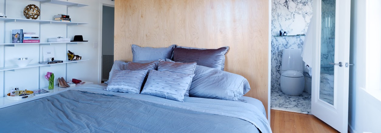
I had a melt down when I saw some pictures of the condo which resulted in a very busy January for us. They were things that honestly needed to be done years ago and I just cannot believe we waited so long. I have NEVER loved our master bedroom. I mean, I loved the actual bones of the space but we just never invested in the details of the interior design. Our philosophy was that we were the only ones who saw it, so we spent the majority of time putting all the details into the living area and kitchen.With the home being on the market and the new year, I decided that I wanted to really design the space the way I wanted it all along. I want potential buyers to see the full picture of what this amazing space can provide for their lifestyle. I want them to walk in and have our home tell a story and ignite their five senses. I now spend the majority of my time in the master writing with the gorgeous downtown views in my sight. Opening the shades and greeting the sun is the first thing I do when I wake. It's pretty much perfect now and time to leave it...funny how that always works out...
And truth be told, your master bedroom is a place for you. It's a place for relaxation, rejuvenation, recharging. It's the one place you start and end each day and it should be the most beautiful, functional, coziest space in your whole home. If you have a partner, this is also the space where you are with one another in intimate settings. It should ignite romance. I will now always start here when renovating and decorating.
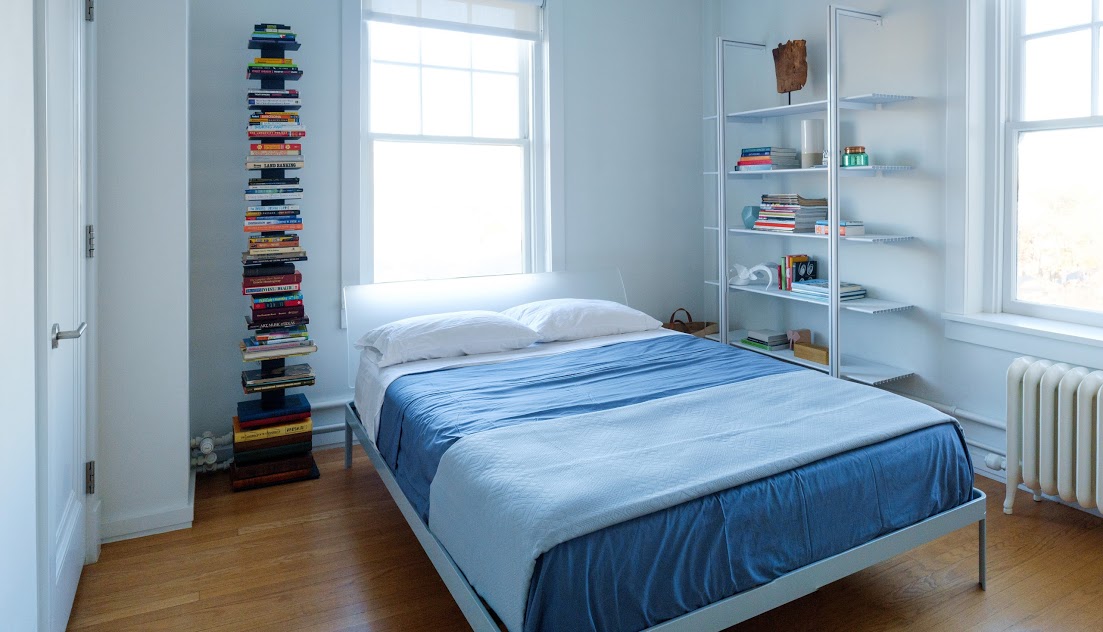
Same rules apply to the guest room that always gets neglected in every house. This is the place where your guests visit and you should really want them to feel like they are in a special place. We always love staying at luxurious hotels and there is zero reason why your own space cannot feel like one. And don't even get me started on an office area. This should look and feel amazing. You need to feel inspired by your daily surroundings. This is the place where the magic happens, especially if you work from home. This is the place where your money is made, the place where you are providing solutions for clients and so on.
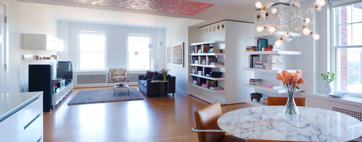
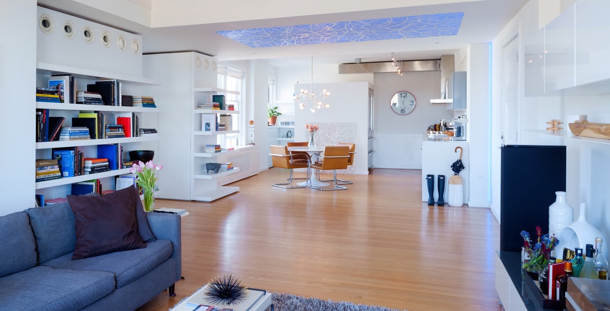
Anyway, if you are in a rut with your current space or also have a home on the market that needs some sprucing as people are so visual these days, I have decided to share some of the things we did with you all. We did spend about a grand doing it but in the end, it was so worth every dime. I have fallen even more in love with this beautiful unique space that my sweetie designed. He has such an eye. You can learn more about Lin and the details that went into this condo here. I do highly recommend it! I think you will be in awe. (we have added some more shots too today for your virtual tour)
Sam's Tips:
BEDDING: Keep bedding neutral. Bold colors and busy patterns will make the room feel heavier. With light colors, the room will feel lighter and more conductive to conversation. In a modern space like ours, neutral colors will really create clean airy space. And from a buying perspective, you have no idea if your potential buyers will be female or male and it's really hard for people to look past things even though they are not buying your furniture and belongings.
Beds also take up lots of room in a bedroom. They not only take up lots of actual space, but visual space as well. That’s why a beautifully made bed can make the whole room look and feel absolutely amazing. Designers know this and use bed linens to their maximum potential. I see this in all of my home decor magazines and books and of course you always get a taste of this as those gorgeous hotels on vacay. A fabulously made bed can make the whole room appear updated and chic and beautiful, even if the rest of it is very ordinary. And layering bedding really amps up the wow factor even more. Make people want to jump in your bed. You are a well-dressed woman, give yourself a well-dressed bed!
How to create the layers for your bed: (I got this from Apartment Therapy)
1. Start with a solid color fitted and top sheet with matching standard pillow cases to give the eyes a place to rest and emphasize the patterns that they will be layered with. White is always a great, clean and refreshing base to begin with. (we did white in the guest room and opted for a grey in the master)
2. Next add your quilt. You could go with a multicolored quilt or stay fairly duo or monochromatic using the pattern or texture to add visual interest. (if you have a modern property I prefer texture over pattern but you do you boo)
3. Fold the top quarter of your sheet and quilt down past your pillows to create a nice visual break in pattern.
3. Now we come to the pillows. Choose pillow shams that will match your quilt. They don't have to be an exact replica but should play off each other in color, style or texture. Your shams will be placed furthest back against your headboard and your white or solid colored pillow case will go in front of them.
4. Fold up a duvet or blanket at the end of your bed that contrasts your quilt and pillows as an accent.
5. Finally add in a small mix and match throw pillow or two in front of your white fitted pillows and you're done!
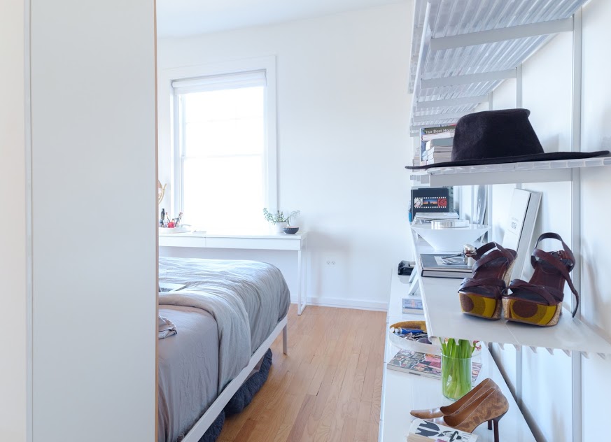
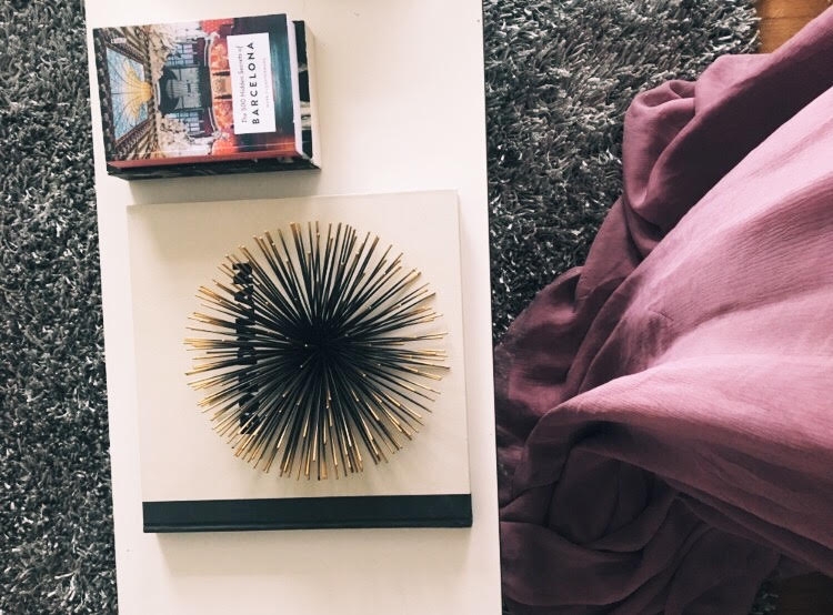
INCLUDE SOME WHIMSY: Little surprises keep a house from becoming too serious. It's fun to put items in unexpected places. Choose colors that flatter you. I think I speak for all women — and probably men — when I say I want a room to show me off at my best. We also personally did not want to buy too much. We wanted to stay in our budget when filling shelves and adding some nice modern items. So it became a really fun project to design with shoes, jewelry, books, and beauty products. Being a music lover, I also incorporated some great Bob Dylan pieces and feel that our little nest now shows off our personalities but still keeps things modern and clean.
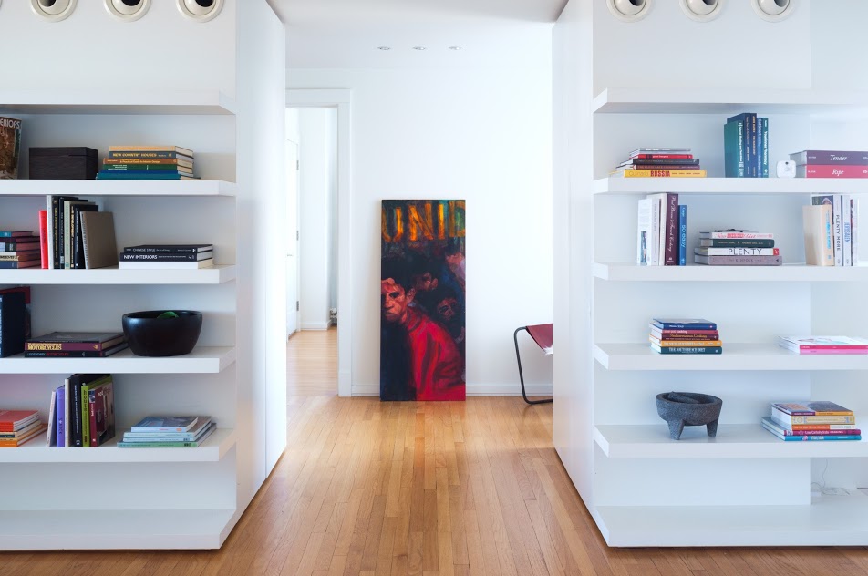
LOSE THOSE BOOK COVERS: We had Stacy Suvino come over who has an impeccable eye to come give us some tips. We are in our space everyday and we needed a fresh set of eyes to look at it. She was happy with what we had done but changed a few things with the shelves and pantry and then perfected our bookcases. This is a huge focal point of interest and space in our living and dining area. We had toyed with it forever and could never get that clean crisp bookcase we longed for. Stacy created it by removing all of the book covers. It sounds so subtle and it was...it is but I am telling you it is EXACTLY what we have been trying to create. It changed the whole appearance of the room.
What do you guys think?!
Whew.
It's a gorgeous day in Tulsa today. Lin is off bowling with friends and I am about to cook a delicious dinner and open up a bottle of wine!! Hope you all had an amazing weekend.
I also hope you have been inspired with these simple easy tips and tricks! Our home is on the market so spread the word!
Do you have any special tips and tricks for me that you have done to your cozy little nest?!
XO
SAM
(all photography was shot by Phoenix Moore)

