Brilliant Condo
Good design is making something intelligible and memorable. Great design is making something memorable and meaningful.- Dieter Rams
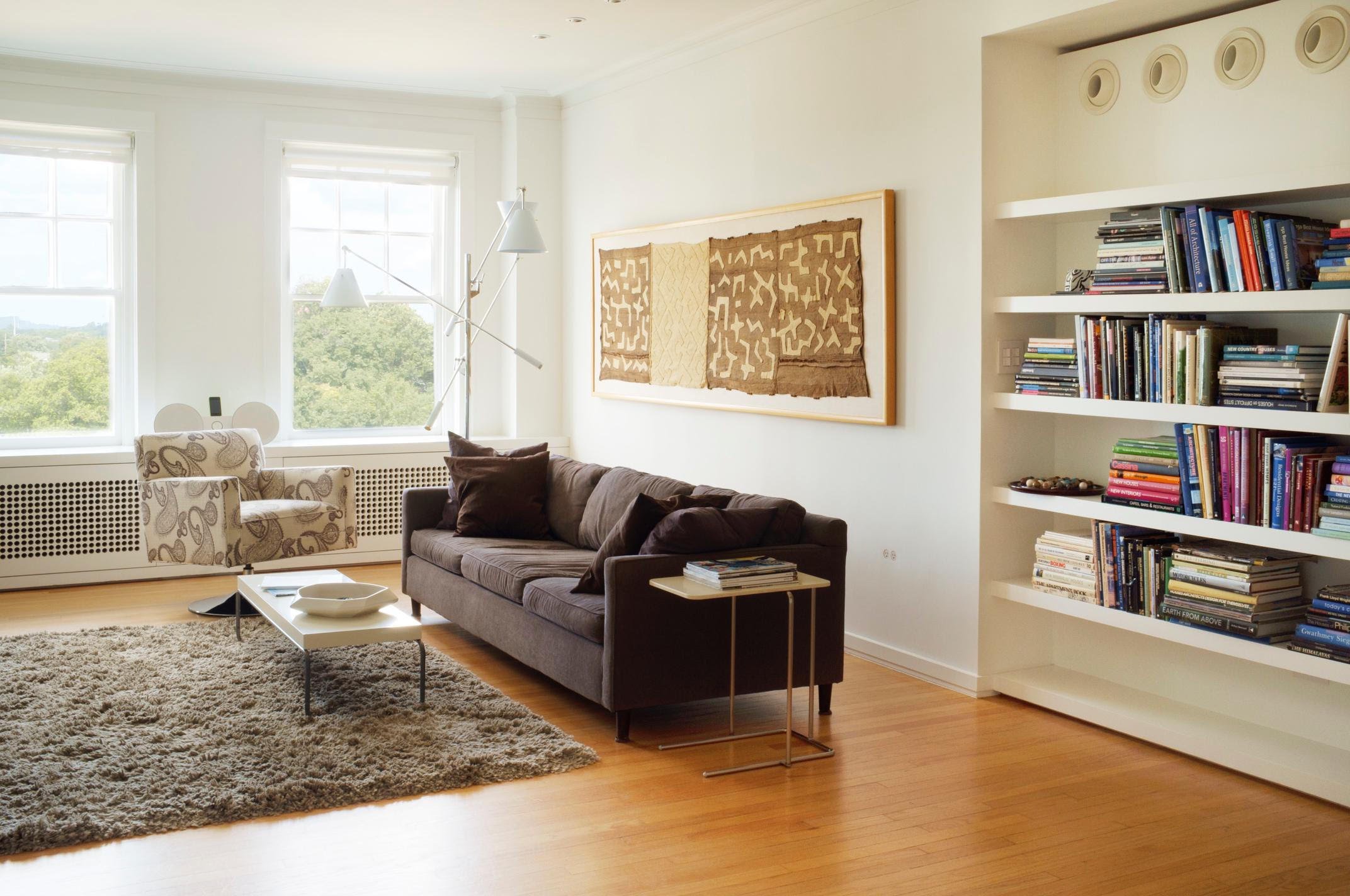
When your realtor tells you she needs some questions answered and wants to hear a story, you deliver a story. And why not deliver a story interviewing the person behind it?! So at last it's finally time for you guys to get up close and personal with my very own incredibly brilliant boyfriend Lin Bacon. I have officially known this man for 6 years now and he still surprises me daily. He designed the condo that we reside in currently and it is truly a masterpiece. It's on the market right now as we close this chapter here in Tulsa and begin a new one in Spain in January of 2017.
He loves architecture. Whenever we go to a new restaurant, museum, hotel, airport even, he is constantly looking at the structure and design of places. He touches the walls and just takes it all in but you can really see his passion come through. And he's always sketching.
Leaving this home was probably one of the most difficult decisions he ever had to make. It's an incredibly emotional time and an even more emotional process. Like an artist who works so hard on a show and sells every single painting, sure- how exciting but also so sad. I am no artist but I feel like you would get emotionally attached to your art. It has to be the same for an architect or an interior designer or a fashion designer actually. Incredibly bitter sweet. I wanted Lin to have photographs of his "baby" just to cherish mainly but also to keep in the family to show future grandchildren or future clients should he ever decide to take on a project. It was a no brainer to hire the equally brilliant Phoenix Moore for this task. Lin and I both admire Phoenix's work. He has an incredible eye and he worked for an architectural photographer in NYC for a year so he had the experience shooting interiors all though that's not his first passion. Most important to us, he loves our condo and is in awe of the design and I knew that would translate in his photos. He's always my first pick for any of my personal styling shoots. (All condo photography is Mr. Moore's)
Excited for you to learn about The Sophian, Lin, and the whole process of the beautiful condo being born and the amazing lifestyle this condo has provided us. We will miss it greatly. Every nook, every window, every light fixture, and every detail....will be missed. Lin practiced as an engineer in his career starting his own very successful company but has a degree in architecture that he mainly used for himself. He also started a small side company Green Tooth LLC to design properties in an ecological and sustainable matter. He has always been interested in breathing new life into older buildings. Don't stop reading!
Space is the breath of art. -Frank lloyd Wright
Interview with Lin.
-What initially attracted to you to The Sophian and wanting a home there?
I have known about the building ever since I was a kid. I had a friend who's father used to live in the area and the old street cars would come up and down 15th street right right by the building. Funny enough I even would swim at The Sophian during my college years with a friend of a friend who lived there. The building has a lot of history being built in the late 1920's and there is nothing like it in Tulsa. I wanted a home there because I loved the proximity to the river but also the closeness to downtown was appealing to me. I lived in a big house in Maple-Ridge and all though it was brand new it still required so much maintenance and up-keep and I was ready for a place where I could get away from that. I wanted something with a great view of the river and the downtown skyline and a place where I could travel and just lock the door and leave my worries behind.
-What was the canvas of the space before you began construction?
The space was mostly ALL original. The floor plan was very formal and everything was cut up into distinct rooms so it was not open at all. The space did not take advantage of the natural light and balance that was possible making the space feel dark and cold. Every room was painted a different color too so nothing was cohesive.
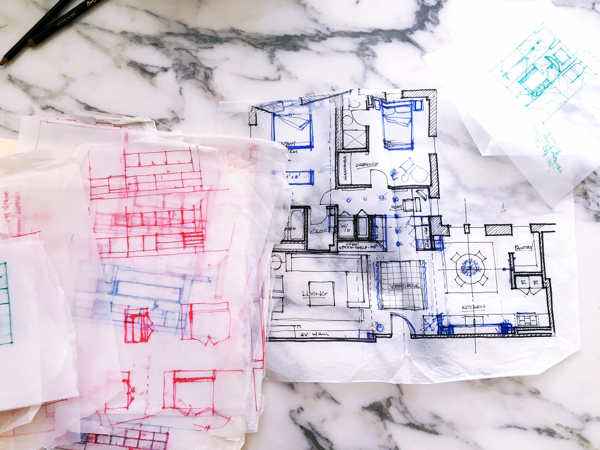
Lin actually saved all of this stuff. I never saw these until today myself.
-How did you approach the renovation? How long did the planning take?
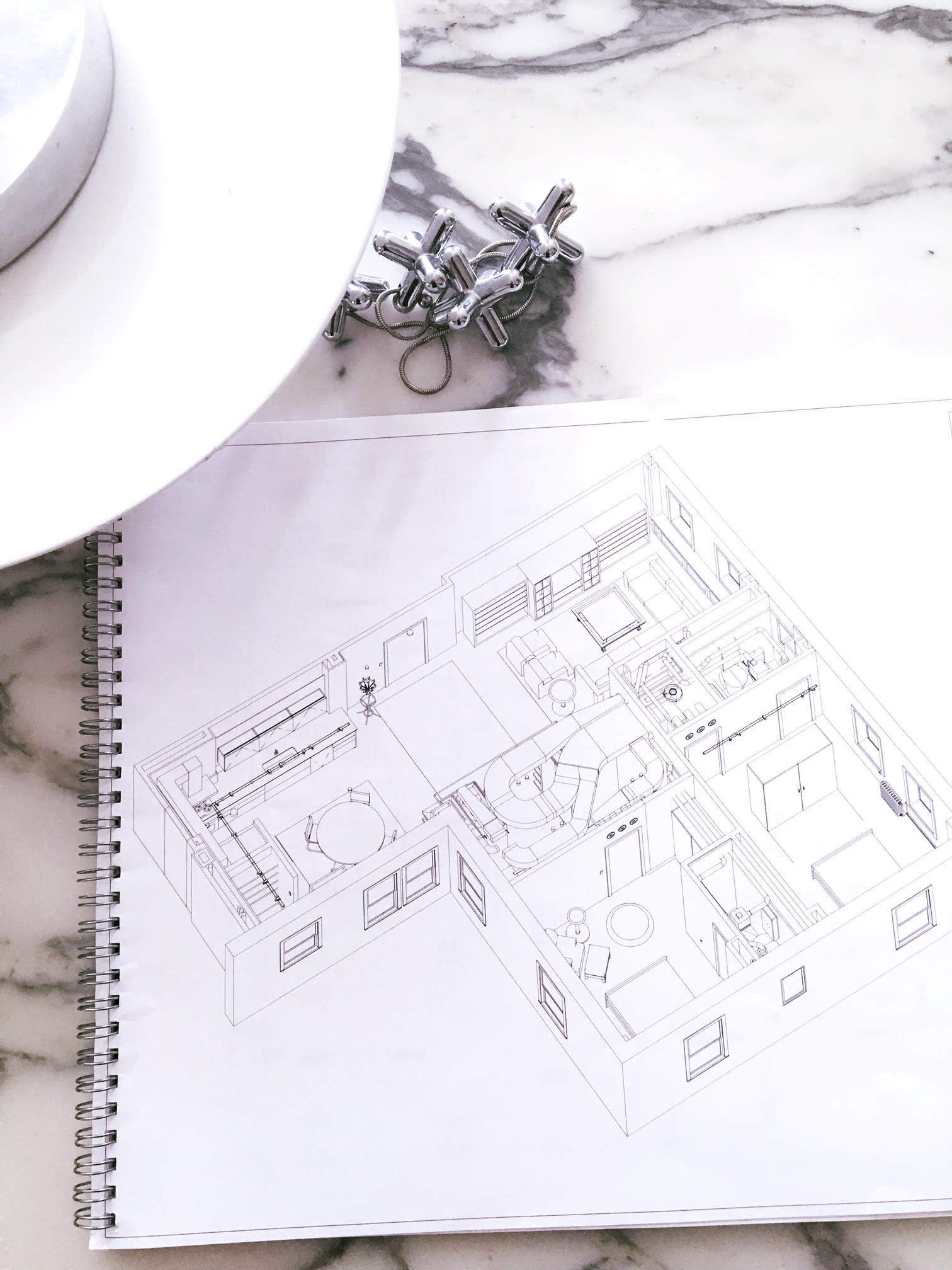
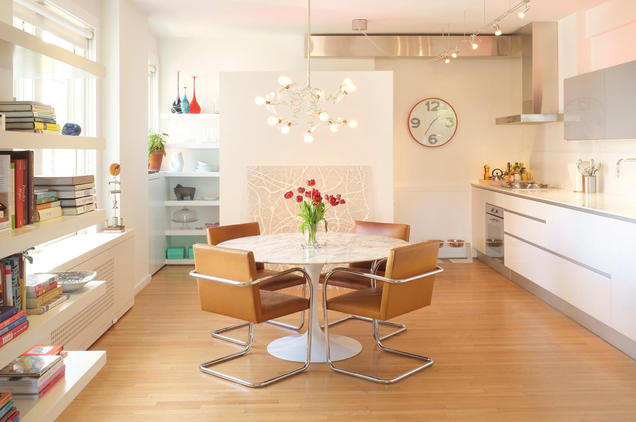
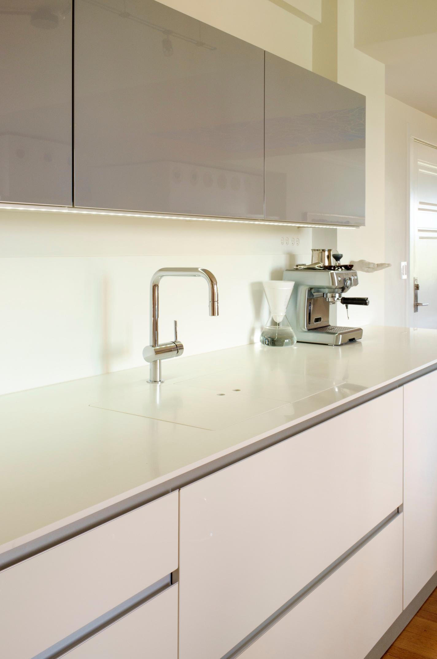
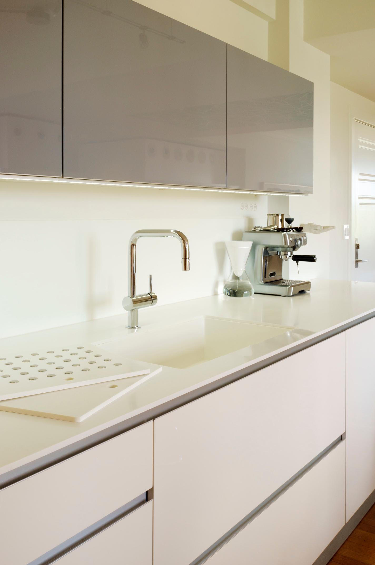
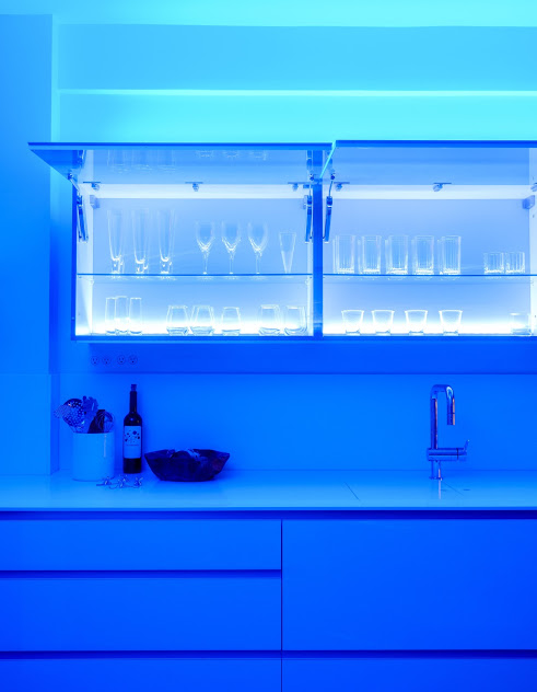
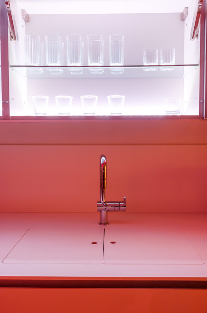
I was renting in the neighborhood at the time and had been looking at real estate in the area so I already had an idea of the market place and what I wanted. I came to see it and saw so much possibility that twenty minutes after the showing I bought it. I am a three dimensional thinker meaning I am constantly thinking things out in my head so once I am ready to put it on paper, it actually all happens really fast. I basically designed and completed 95% of the drawings within about 30 days during the closing period before I even took possession over the property. I met with a great friend of mine who is a fantastic architect Scott Phloenz who owns Pohlenz Cucine Moderne in Tulsa. He was instrumental in my kitchen planning and design. He guided me to go in a direction I may have not gone in otherwise.
- How long did the actual renovation take?
About 10 months. I wanted everything to be perfect. It was all professionally designed and engineered top to bottom using some of the finest products and materials available. I used environmentally safe components including non toxic paints and finishes. The plumbing fixtures ( Il Bagno Alessi by Laufen, Philippe Starck by Duravit) are all high end European products and I had to wait for them to ship from over seas. ( and yes there is a such thing as an attractive commode...just ask Stefano Giovannoni.) Some of the lighting fixtures also were shipped from Europe so that took some time.
-White is such a huge presence in this condo? Why white?
Haha. Ask any architect what their favorite color is and most of the time they will say white, however what most people don't realize is there are a zillion shades of white that can significantly change the look and feel of the space. For another as I previously mentioned the condo was painted all different colors. It was a montage of style and color and I wanted a more contiguous and monochromatic look to bring it all together. I wanted it to look open, bright, and cheerful even on dark and gloomy days. White was also out of favor at the time and I tend to be sort of a contrarian on style and trends and now white is virtually everywhere in high end spaces and designs. I wanted a clean and simple back drop that would highlight furniture and art.
-What have you seen on previous travels that inspires you and your work? Anything particular that comes out in 7B?
I love design of all kinds..architecture,industrial design, clothes, cars, motorcycles, etc. I have traveled a bit to major cities and Europe and love how designers juxtapose the new and modern against a backdrop of old and historic buildings and structures and I think it provides a very sophisticated yet causal and interesting look that's really rooted in history. The entire condo has a European feel.
I also frequently am inspired by Wallpaper, Habitus, Objekt, Dwell magazine and Architectural Record.
What are your 3 favorite things about your condo?
Quietness & Serenity.
Comfort.
And quality feeling of the space.
-What would you say are my favorite things about the condo?
Bathtub with hot water that never runs out.
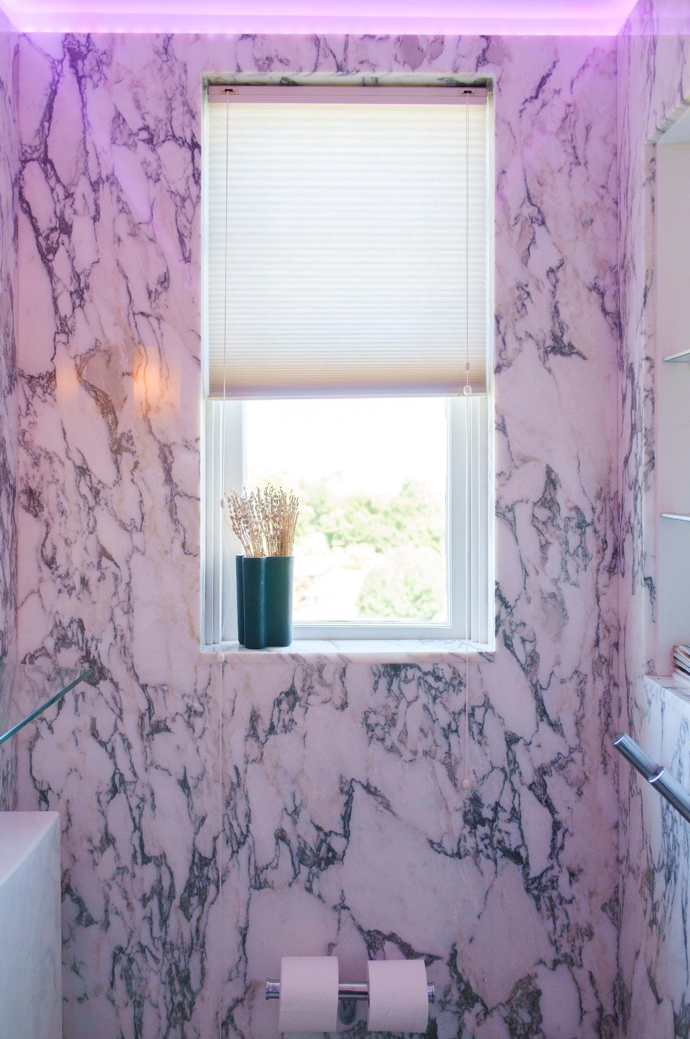
Steam heated marble slab walls and floor that provides cozy toes and warm towels
Watching the snow fall seven floors up
The integrated library in the living space.
(Yep. He nailed it.)
What is the one thing that you will miss the most about the condo when moving to Barcelona?
Sitting in my living room swivel chair with the windows wide open in the fall time . The condo is like a tree house. The building actually pivots at a 45 degree angle optimizing the natural light at different times of day and the breezes from The Arkansas River. I will miss these things.
What do friends say about the condo when they enter for the first time?
You would have to ask them but I have heard the words museum, NYC, and modern. I think many people are in awe.
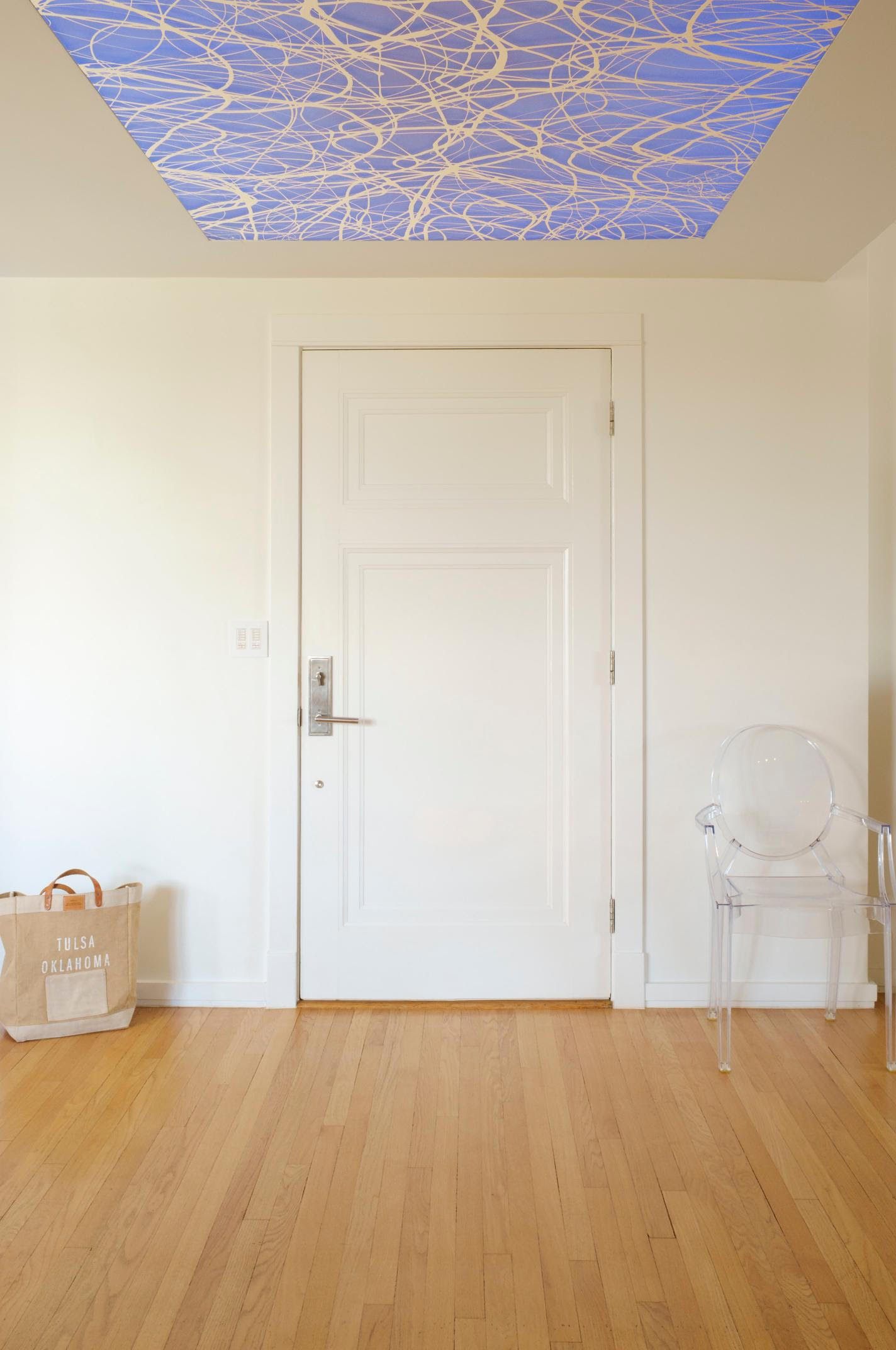
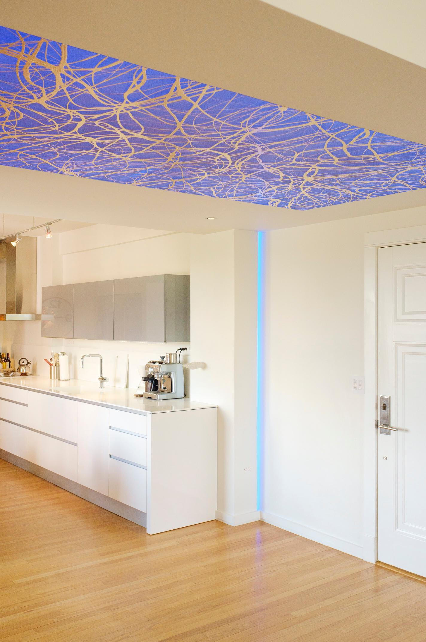
-The Ford Beckman piece in the ceiling? Tell me about this beautiful installation and how you got him to do a commission piece he had never done before.
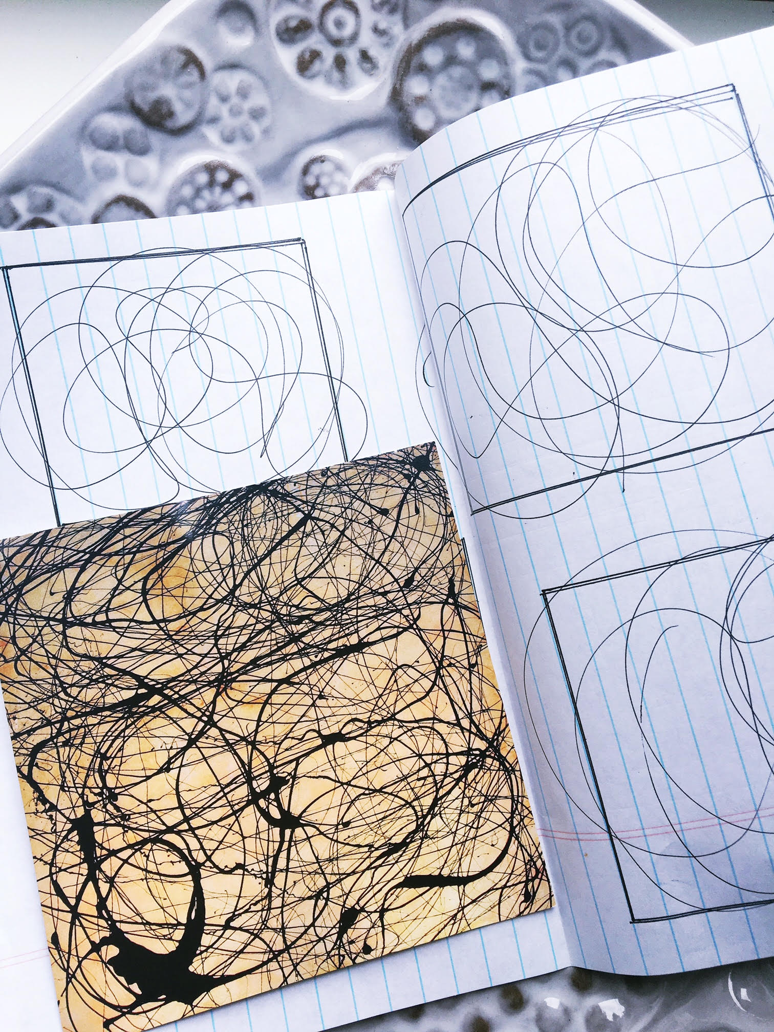
I caught a glimpse of Ford's art in a gallery window while I was driving down Peoria one night. It caught my eye instantly and on further investigation I discovered the great Ford Beckman. He called his pieces "rhythm paintings". When I was working on the design with Scott Pohlenz I had been trying to come up with the main entry ceiling treatment and had done a lot of different designs but was never quite happy with it. I knew I wanted to create something really special with indirect LED back lighting of some type but couldn't quite come up with what I was looking for. Scott suggested I talk with Ford and collaborate. So I did and the rest is history. I met Ford and we sat down and came up with an idea he had never done before but basically its a rhythm painting on sand etched acrylic and I figured out how to mount it fully recessed and flush in the ceiling. That acrylic slab weighs about 300 pounds, yet the piece looks light and airy and the paint almost floats off the glass. This is the piece that gets the most attention from visitors.
(The hand sketched scribbles below are actually Ford's.)
Who are your architecture inspirations? From the past and still living?
That's a really hard one because there are so many but the few that come to mind..
From the past: Louis Sullivan, Eero Saarinen, and Mies Vandero
Living: Phillippe Starck, Renzo Piano, I.M. Pei
-Where did most of the home furnishings come from? Your fave places to shop?
SR Hughes, Design Within Reach, and other furniture markets in Dallas and New York and around the world.
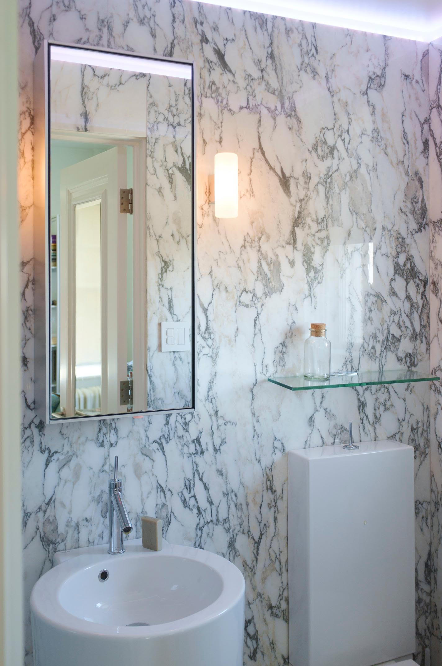
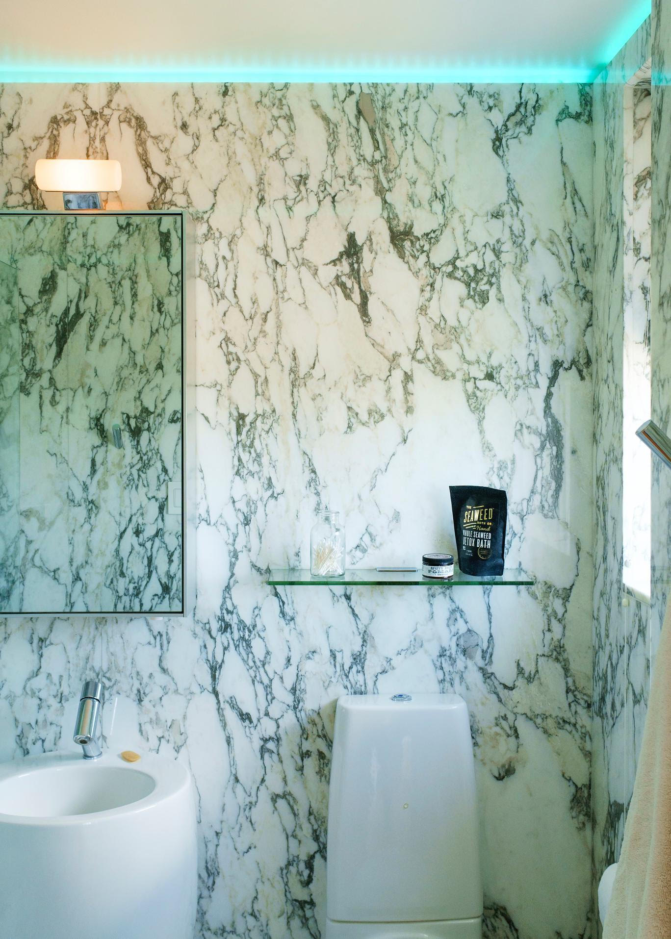
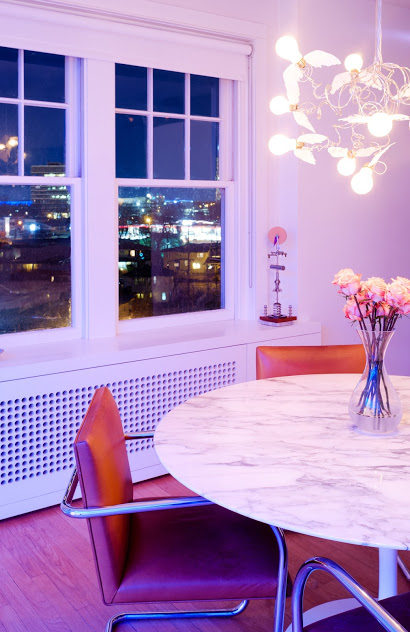
The Saarinen Tulip Table from DWR was actually the inspiration for the marble in the bath-rooms. My whole concept was to keep everything simple but very coordinated and I wanted to have an intertwined color palette within my materials. It took me and my supplier Midwest Marble over 6 months just to locate this specific marble in Italy to match it perfectly.
-What advice would you give to young designers starting out today?
Be an accountant. HA!
-Whats next for Lin?
Motorcycles in Barcelona. Learning foreign languages. Enjoying time with my lovely girlfriend and my two dogs and who knows......I have only been retired for a little over a year so I am in no hurry to get too busy. But maybe I need to design something in Spain.
Good Bye sweet sweet condo.
Now who is the lucky one that purchases it?!
See additional photography here.
Shop the story here.
Xo
Sam


