A Few Things To Know About Our Santa Fe Town House Renovation
In October, I gave you guys a little info on the Santa Fe home we purchased. The fact that it’s already so very special to us makes this renovation project that much more fun and we truly can’t wait to bring its full potential to life. So today, I’m going to share an overview of what exactly it is that we’re doing over at the new place.
Take a look here for what it looks like now when we purchased it…..
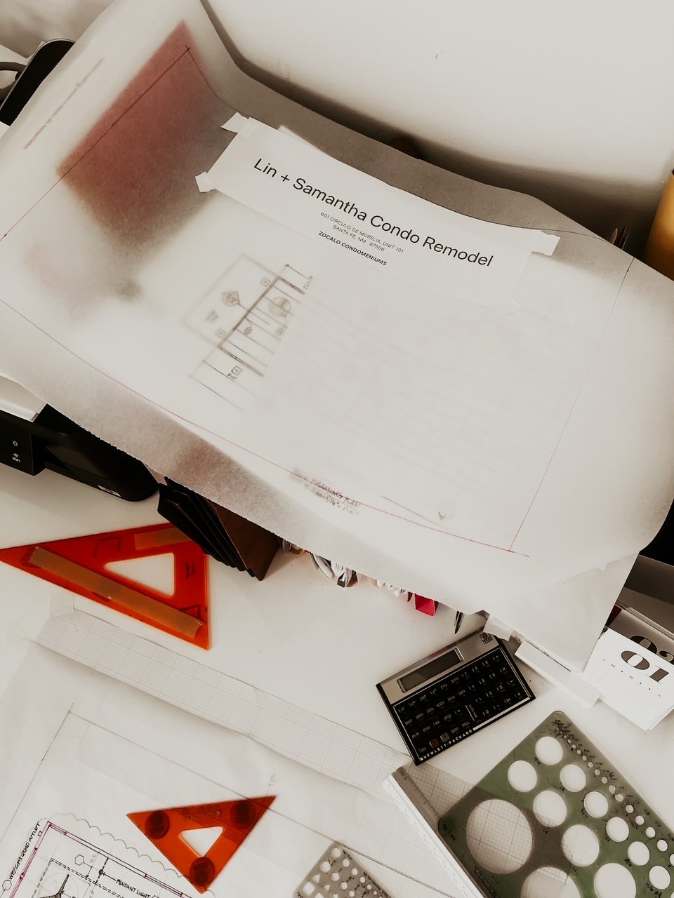
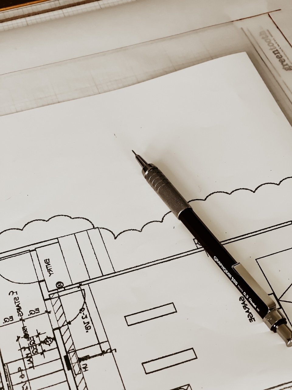
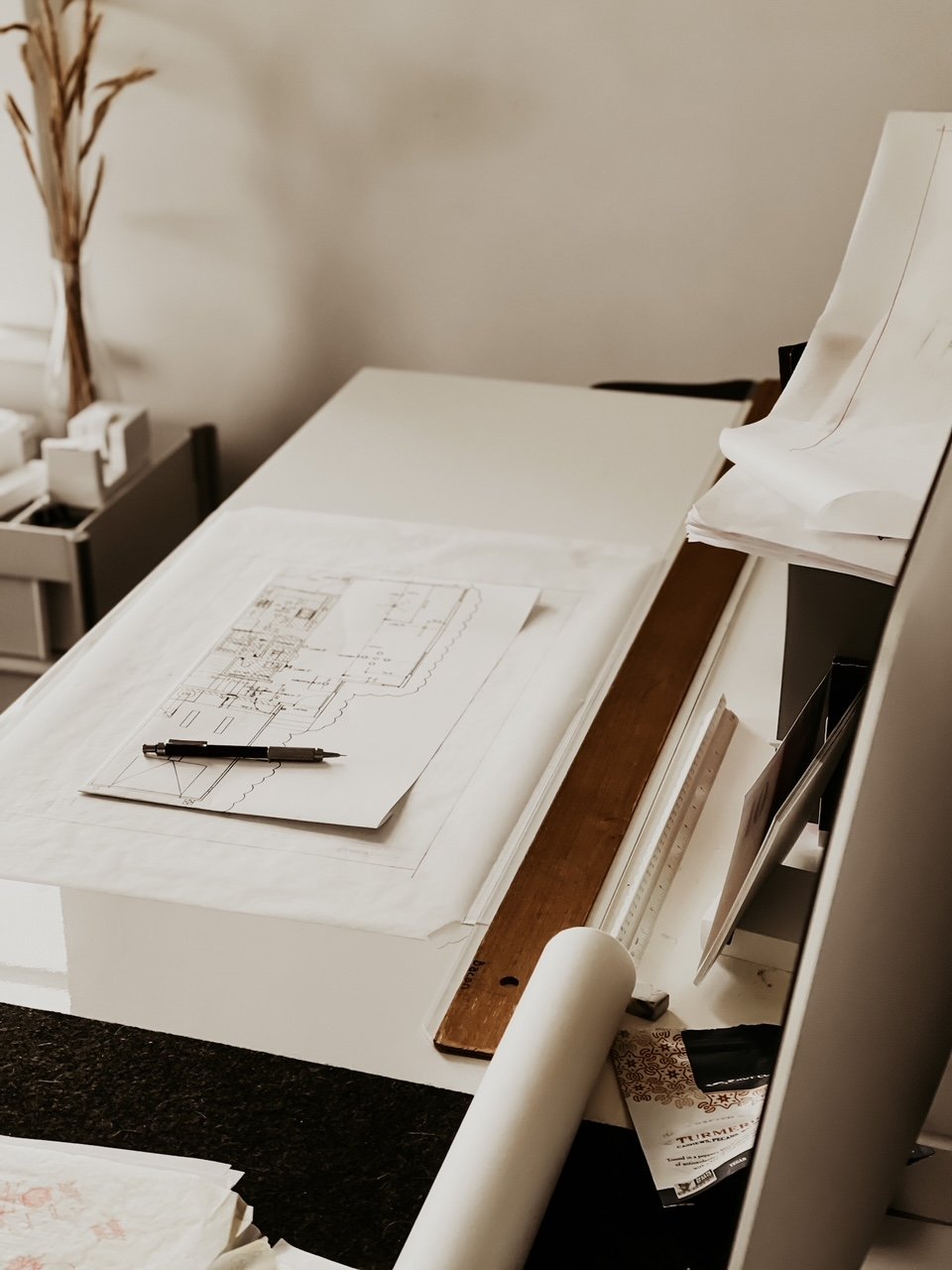
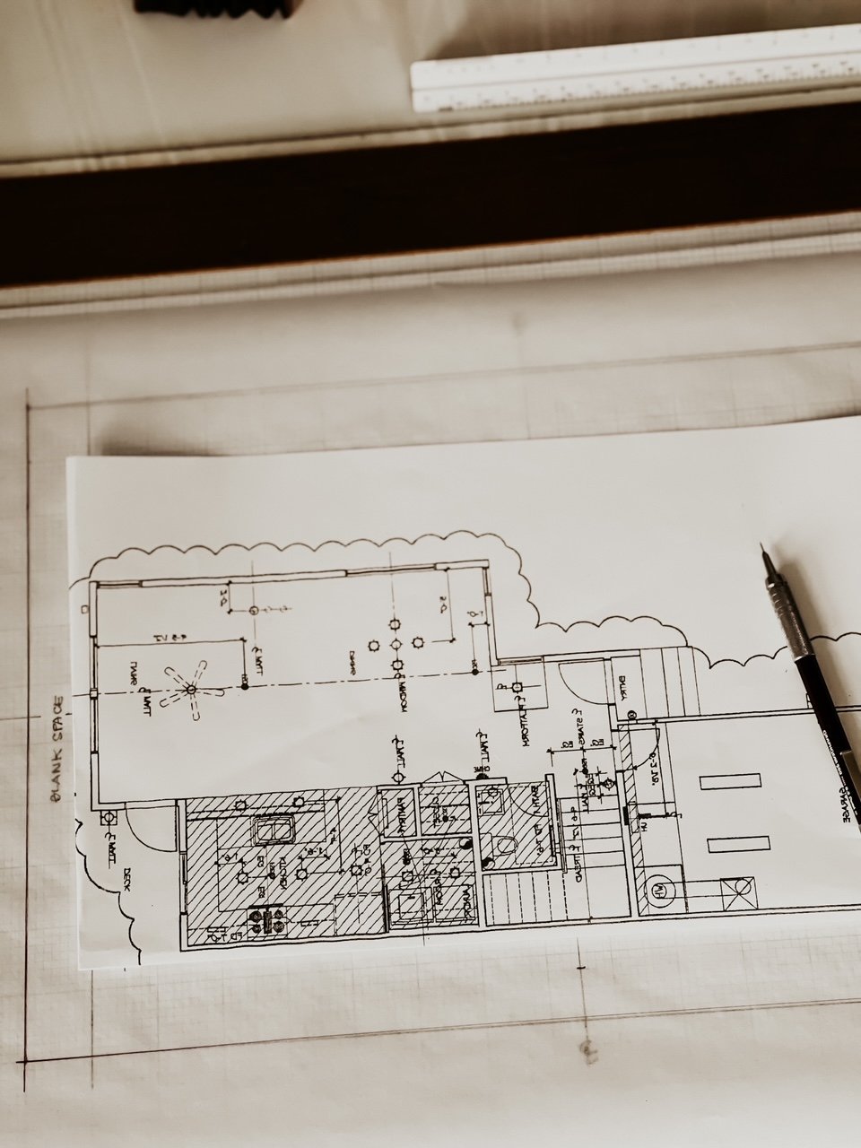
For the last several months, Lin has spent nights and weekends heads down working on this project—it’s truly been like a second full-time job (but instead of getting paid to do it we’re paying a lot to do it, haha)—and it’s been hard keeping all of this initial planning to ourselves when there were so many things I wanted to share. But with design being such a process anyway-we chose it would be best to get rid of all that outside noise. I mean all of a sudden strangers on the internet want to become architects and interior designers, right?!
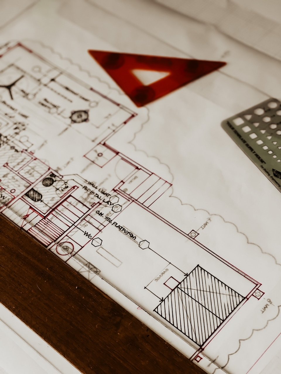
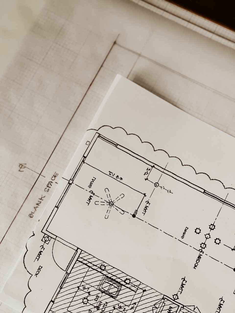
So it’s time to make up for lost time, because although we’ve pretty much figured out the vision and architectural plans, there are still so many decisions to be made. Stone, plumbing fixtures, paint color, wood floor options… we’re about to get into the nitty gritty of the design details.
WE’RE calling it, “Modern Southwest” style
The architect, Lin, of course, designed the new plans to make the most of the main design components that were already in the space. That includes the dark tile floors throughout the first floor and the warm wood cabinets in the kitchen and on all the doors. Would it be our first choice, absolutely not, but we are working in a budget and it also seems silly to just get rid of those features when we know they are going to be the most desired if we sell this place which we plan to do later on down the road.
To create the casual, warm aesthetic we’re envisioning for this space, we’ll be leaning into a lack of ornamentation to create a sense of calm. That means that decorative details will be kept to a minimum on the first floor allowing the beautiful desert landscape outside the windows to take center stage. The dining room view alone was one of the main reasons we fell in love with it after all. It’s really reminiscent of a simple canvas, but I feel confident we can layer on interest with furniture, textiles, and some minimal decorative details.
FOR THE KITCHEN:
For The Countertops: MARBLE
I’m endlessly fascinated by the various types of stone but there’s something romantic and almost mysterious about dramatic veins running through a slab of marble ! The natural beauty of the marble veining captures the attention immediately being the centerpiece. Everything around the marble simply compliments the beauty. We love matching marble with other materials, especially in the kitchen. And it’s so beautiful with chrome which is what we chose for our appliances and hardware in this room. We thought about doing brass but at the end of the day felt that was too trendy and just did not have that timeless elegant feel we want in a kitchen. Yes, we know marble can present a challenge being in the kitchen where we cook (our contractor suggested. faux marble and you can imagine how that conversation went) but I am willing to take the chance! Marble will also be used on our backsplash too. We considered tile but the floors being tile is simply enough for us! I don’t think we are tile people after all!
Tile scares me a bit! There are so many factors to consider: horizontal versus vertical, stacked versus staggered versus herringbone lay… and then there’s the grout.
For Hardware: (and appliances)
Plumbing fixtures and hardware are some of those seemingly small details that can completely change a room—the impact of chrome hardware sets a completely different tone than matte black or brushed nickel or brass in my opinion. Plus we just bit the bullet on all new stainless steel appliances including a new induction range. I love love love my Smeg gas stove like crazy! There is something about seeing a flame when you cook but excited to move to induction. We do feel like electric is the future and things will move that way anyway so we will be ahead of the game.
We went with the Bertazzoni induction range ! The new Bertazzoni ranges are superb cooking appliances designed, engineered and made in Italy. All Bertazzoni appliances integrate seamlessly into style-harmonized suites for a true, high-performing kitchen. This all-new induction range has 5 high-power heating zones with maximum power output of 3700W. The right-side heating zones can be bridged to create a larger cooking area. Each induction area is controlled with knobs and has a convenient read-out interface on the glass worktop. We chose Bertazzoni for our ventilation hood, dishwasher, and fridge too! And luckily there was already an electrical panel on that wall so we could finally save some money. HA!
They have such a beautiful story ! And you can read about them here.
And if you have any good tips for me on cooking on an induction stovetop -let me know! A few chefs I know tell me I am going to love the switch from gas to induction cooking because of the extremely fast heating and precise heat control provided through a high-performance glass-ceramic surface. Also, induction technology warms the pan and not the surface or surrounding area, so very little heat escapes into the room. Other people tell me I am going to really have to adjust and might hate it at first! But that also having the right cookware is key!
We are switching out the sink and also adding some floating shelves and reworking the bar area so it’s flush with everything and looks more like a big island that will sit three and will be a great area for coffee and breakfast. All of that will be in marble and we will look for some nice comfy warm leather bar chairs. I will write another post when we start deciding on furniture but right now it’s really just the major renovations that are happening before we can even move to furniture and textiles…curtain choices, etc.
This will fall on my shoulders and I have started my email campaign with brands I want to work with. However if you are a brand that aligns with my aesthetic and want to work with me I would love to hear from you!!! Please please reach out.
DINING AREA AND LIVING AREA:
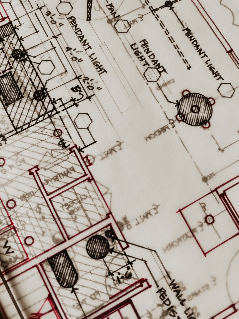
No major changes will need to be done here…just lighting fixtures. Taking out all the track lighting and adding a ceiling fan and bought a really beautiful chandelier for the dining room. It’s The Eos Pendant by Soren Ravn Christensen and we are in love with it. We went with light brown and large of course with a black cord. Thousands of goose feathers surround the bright core of the UMAGE Eos Pendant, a design that is a statement of humane practices and sustainable production. The feathers are procured responsibly, sanitized and repurposed for the fixture, then attached to the paper structure on the inside. The Eos is fire-resistant and easily maintained; you can clean and revitalize the feathers with a hair dryer.
Launched in 2008, UMAGE (previously Vita Copenhagen) is a Danish company with a holistic approach to design, producing approachable lighting with sustainability in mind. UMAGE takes great pride in their compact shipping methods, reducing the cost of their designs and the cost of damaging the environment. Historical Scandinavian design has a clear influence on their range of pendants and portable lamps, manifesting in lightweight and modern materials that can accommodate casual or luxurious spaces.
Adding pendant lights to the bar area too in a coffee color! These feel very nordic and we are not entirely sure on them until we see them in person. So this could possibly change.
DOWNSTAIRS POWDER ROOM And upstairs bathrooms:
I don’t want to get ahead of myself here because we are STILL working on these 3. But I can tell you a new pedestal sink has been ordered for the downstairs powder room and new toilets have been ordered for all 3 bathrooms. New lighting fixtures have also been ordered for 2 of the 3 bathrooms. Moody paint samples have been shipped too as we are venturing into darkness! HA! Soooo different for us. But currently they each already have nice black tile and we are just going to work with it, rather than fight it.
Adding wood floors to the stairs and all of the second level as well! And both bedrooms will be getting ceiling fans.
So as you can see this is such a work in progress and doing it from Tulsa has been super challenging.
But divide and conquer, we shall.
I will keep you updated and just cannot wait for you to see the finished space! We cannot wait to see it either!

